Depth First
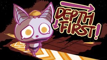
You are an AI core trained by a CRAZY DR. Your “Master” believes there is a HELL. Driven by a depth-first cursed algorithm, guide your robot through procedurally generated labyrinths: place turn stones to avoid lava flows, activate laser guns to blast through walls. When you finally breach Death’s domain, how will the underworld bureaucrat judge this human-led suicide mission?
🔥🔥🔥🔥🔥🔥🔥
Important Things To Know:
DFS in this game prioritizes in order ➡️⬇️⬅️⬆️
Basic Controls:
🏆➡️Left-Click to Place Turn Stones:
Place stones on upcoming tiles to forcibly alter robot’s moving direction
📤🖱️Right-Click + Hold&Drag:
Move around to see the whole map
🚶♀️🧭GO Button Starts Pathfinding:
Robot moves with Right → Down → Left → Up priority after clicking
🔄🌍RESET Reinstates the Level:
Click to remove all stones (NO LAVA AND BROKEN WALL WILL BE MOVE)
Tiles you need to know:

Floor, of course, the place you can walk through(hopefully)

AH, LAVA! deadly, very deadly, VERY VERY DEADLY
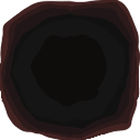
The END, jump down and find it(to find what)
Why does it always appear in the bottom right corner

A Laser Gun! what can it do?
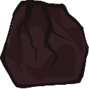
Aha! A CrackedWall, this is where the laser gun should be used.(OF COURSE)

Turn Stones, It teaches you to turn early
| Status | Released |
| Platforms | HTML5, Windows |
| Authors | PassbyKamenRider, Yufeng Liu, Furumi_i |
| Genre | Puzzle |
| Made with | Unity |
| Content | No generative AI was used |
Comments
Log in with itch.io to leave a comment.
First off, I want to praise the art and overall design. It’s visually engaging, and the connection between elements feels well thought out. However, I think it would be helpful to provide a brief explanation of the Depth-First Search (DFS) algorithm at the beginning. A quick overview would make it easier for users to understand the logic behind the mechanics, especially for those unfamiliar with DFS.
Additionally, it would be great to add a UI guide at the end, perhaps just a simple arrow, to help users navigate the interface more easily. I also noticed that the colors for the CrackedWall and the end are quite similar, which makes it difficult to distinguish between the two. It might help to either adjust the colors or add a clearer visual cue to differentiate them.